Priceline · Lead Designer · Internal Tool · CRM
C3: Enhancing Agent Experience Through Design
Rearchitecting 20 years of legacy tooling onto a modern CRM, using design to transform how frontline agents work, think, and feel about the tools they use every day.

12%
improvement in average call handle time
13.2%
average improvement in first call resolution
$4M
in operational savings
675
bps increase in Customer Satisfaction
Context & Challenge
When I joined Priceline's Customer Care team, I was the first designer they had ever had. That came with its own advantages and disadvantages. On one hand, I had direct access to my primary user and could define what good design meant from scratch. On the other, there was no precedent, no design system integration, and no framework to build from.
One of the company's biggest initiatives was to improve the customer service experience — and a core part of that was migrating off CARES, a legacy platform over 20 years old that had been built by developers, and consolidating all workflows into a modern CRM called Kustomer, internally named C3.
The operational stakes were immediate: every contact handled by a customer care agent has a direct cost to the business, and agents working in a cumbersome tool are slower, more error-prone, and harder to retain. My job was to define what good design meant for this team, and then build it.
Known Friction Points
CARES reflected an earlier service model: agents were expected to verify claims through fragmented workflows rather than resolve issues from a unified customer view. Four core problems made the case for migration:
Platform built on distrust. The historical approach was to "invalidate" a customer's claim rather than build tools that help agents solve the problem. The system was designed around skepticism, not service.
Disconnected data. There was no holistic customer view. Agents could connect callers to bookings but couldn't see a customer's full relationship with Priceline — their history, patterns, or prior interactions.
Poor relationship management. The platform took a transactional approach to servicing that was out of step with today's flexible inventory and recurring customer expectations. Its core proposition was to "check cancellation options," not to actually help.
Specialised training required. The system was so complex that agents had to specialise by product. A hotel agent couldn't take a car call. That made staffing inflexible and training expensive, compounding the cost of every interaction.
Key Stakeholders
The primary users were customer service agents — they were the ones whose daily work would either improve or get harder. But it was equally important to keep the broader ecosystem in view: customer care operations and training, the internal tech team, our CRM partner Kustomer, and ultimately the customers themselves. They weren't the direct users of C3, but the whole point of improving the agent experience was to improve the customer's experience on the other end of the call.
Understanding the Real Work
My first step was to develop a solid understanding of the current platform and all its frictions. I used several methods, including:
- Shadowing agents
- call listening sessions
- focus groups
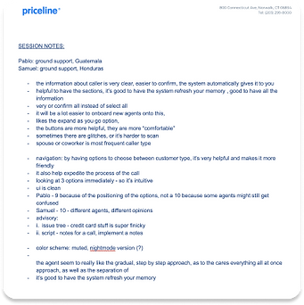
But perhaps the most formative experience was a site visit to Priceline's call center in Guatemala. Immersing myself in that environment gave me insight into design considerations I wouldn't have reached any other way. The environment was so distracting and seeing it in person made it completely clear - which was the noise, the pace and the interface heavily impacted the way agents actually move through a flow when a customer is on the line. In that environment, the interface and the context are inseparable. Clutter wasn't just a usability problem. It was affecting handle time, errors, training costs, and attrition. This insight helped frame the way I knew I had to approach this project.
Your primary tool has to work for you, not against you.


CARES Audit
Alongside the visit, I also conducted an audit of the existing platform (CARES), and documented my findings.

Cognitive Overload
CARES was clunky, relied heavily on user recall, and had poor discoverability — overloaded with icons, deeply nested flows, and no clear visual hierarchy. Every action required agents to hold too much in their head.
Specialization Dependency
The system required agents to specialise in specific products. Specialised training is expensive and made staffing inflexible. A generalist agent couldn't confidently handle any booking type.
Script-Driven Interactions
Agents read directly from on-screen scripts rather than following intuitive instructions. The result was interactions that felt rigid, limiting their ability to be empathetic in complex customer situations.
No Design System
The platform felt entirely removed from Priceline's brand. No shared components, no consistent language. Agents switching between internal tools and customer-facing products encountered completely different visual experiences.
a cluttered interface isn't just a usability problem, it's a performance problem.
Product Strategy
With the research grounding us, the next step was to define the strategic questions that would shape the work. These weren't hypothetical — they were the actual tensions we had to resolve before a single screen could be designed:
How much could we actually simplify these processes, and how much could be automated? How do we integrate Priceline's look and feel so the experience feels like one company, not a patchwork of tools? How do we eliminate the need for specialised agents so any agent can service any booking type? And how do we maintain enough consistency across product lines to make that scale?
That last question carried the most weight. If the UI behaved the same whether an agent was handling a rental car or a hotel, the same person could handle both — cutting training cost and staffing complexity in one move.
The strategic goal was to build a CRM that — for the first time in Customer Care's history — let agents focus on the customer instead of fighting their tools. Four principles shaped every decision:
Minimize friction in every workflow, so agents move through flows without fighting the interface.
Work with the CRM's constraints rather than against them — using iframes for core product actions so we could leverage Priceline's design system while still working inside the Kustomer shell.
One shared vocabulary — consolidating terminology so agents and customers speak the same language, reducing confusion mid-call.
One design system, all products — standardizing interaction patterns across hotel, car, and flight workflows so agents could learn faster, move between products, and rely less on specialized training.
Co-Design as a Process
We didn't have a clean usability-testing cycle for every flow, and direct testing time with agents was limited. So co-design became the backbone of the process. I ran focus groups with anywhere from 15 to 40 agents and team leads at a time. We brought in half-baked concepts, tore them apart together, tested prototypes, and shaped the language together. That shortened feedback cycles and kept the work grounded in how agents actually operated.
One of the biggest design challenges was deciding what should be standardised and what needed to remain product-specific. A hotel cancellation, flight change, rental car refund, and insurance cancellation may sound similar — but operationally they follow different rules. Over-standardise and the tool becomes too generic. Customise everything and it becomes too fragmented to maintain. The approach was to standardise the interaction model, language, layout, and step structure where possible, while allowing the underlying policy logic to vary by product.
Breaking each flow down activity by activity gave us the opportunity to remove redundancies that had accumulated over 20 years in CARES. It also meant decisions were grounded in qualitative data from the people doing the work every day, not assumptions from a product team working at a remove.

Defining the Workflows
Before jumping into design, I needed to translate what we'd learnt into something I could actually build from. For each of the two MVP activities — contact validation and full hotel cancellation — I went through a substantial requirement-gathering process with stakeholders, then fleshed those requirements into detailed user flows. These flows acted as the design guide: a shared reference that aligned everyone on what the experience needed to do before anyone got opinionated about what it should look like.


Working within a CRM
A major constraint was that we were building inside Kustomer. The question was never "what's the perfect tool?" — it was "what's the best possible workflow we can create within this CRM, given its interaction patterns, integration limits, backend dependencies, and engineering capacity?" For core product actions, we designed custom Priceline components and embedded them into C3 through iframes. That gave us more flexibility and speed because we could use Priceline's own design system while still working inside the CRM shell.
I took the CRM's own column layout as a structural starting point rather than fighting it, which became a foundational decision for everything that followed.

Design System & Requirements Constraints
Starting from a blank canvas on an internal tool is one challenge. Starting from a blank canvas while the design system underneath you is actively being updated is another. During this project, Priceline was mid-refresh on button styles, border radius, and other core patterns. That meant design decisions I made early were sometimes invalidated by system updates that came through during the process. While these weren't blockers, they added iteration cycles and required careful coordination with the design systems team.
The upside was that we had a significant runway before development began. That time was used well: continuous feedback loops with agents through focus groups, iteration reviews with the internal tech team, and ongoing alignment with operations as requirements evolved. No design process is linear, and this one especially wasn't — requirements from operations shifted regularly as we got deeper into the technical constraints of what the platform could actually support.
C3 was also a long-running program — requirements kept moving. Projects were paused, deprioritised, and later revived. Operations kept refining workflows while the design system itself was changing underneath us. I had to treat change as part of the process: document assumptions, revise often, and avoid designing too far ahead of what the platform and team could realistically support.
Activity 1: Contact Validation Design Process
Contact validation was the first activity we designed — the flow an agent runs at the start of every call to confirm who they're talking to before making any changes to a booking. The goal I set for myself was clear: the final design should be simple enough that someone without formal agent training could successfully complete it. That bar kept every decision honest.
Existing CARES experience · Early exploration · Usability test

Capture of what the current contact validation experience is like in CARES
Existing CARES experience · Early exploration · Usability test


Initial sketches to help me get started, based on requirements gathered


The first version followed stakeholder requirements closely, and that was useful — the problems became obvious once they were on screen. The right-hand column was packed with text. Agents had to type the caller's name even though the system already had it. We were also asking agents to manually check off information they'd collect from customers, which adds clicks and subtly limits the autonomy and trust an agent can feel. Three areas to push on: the content-heavy layout, the lack of clear guidance, and data capture that added effort without adding value. We removed what wasn't earning its place.
Existing CARES experience · Early exploration · Usability test


After usability testing with 5 agents, once stakeholders saw agents hesitate through the cluttered version and move quickly through the simplified one, the conversation shifted from preference to performance.

I rated the test results using a heuristic analysis; this helped shape the final direction of the design.
Final Design
Activity 1: Contact Validation


Designing for clarity, traceability, and security
Early concepts simplified contact validation by removing detailed logging from the agent flow. As the workflow evolved, we introduced the infrastructure needed to capture those details without adding unnecessary friction. The final design allowed agents to log contact types and review trip details within a single screen, rather than navigating through multiple steps or recording information without a clear purpose.
This created a faster, more intuitive workflow while improving security and traceability. The team gained a more accurate view of contact types and access patterns, with a clearer record of who had accessed a trip — including corporate users acting on behalf of travellers. By making the relevant information and next actions visible at a glance, the experience reduced training dependency and gave agents more confidence as they moved through the flow.

Designing a shared language
As we expanded the workflow, the existing label “Caller Verification” no longer reflected how customers actually contacted Priceline. Agents were supporting phone calls, chats, third-party contacts, and corporate users. I renamed the activity “Contact Validation” to create a broader, more accurate term that could scale across channels and use cases. I also replaced “reservation” with “trip” to match the language customers saw in their confirmation emails. During a support interaction, agents and travellers needed to refer to the same thing using the same words. Aligning internal and customer-facing terminology reduced unnecessary
confusion.
Activity 2: Hotel Cancel Design Process
After contact validation shipped successfully and my judgment was trusted, I took on hotel cancellation — the most common reason customers were calling.
Existing CARES experience · Iterative exploration


In CARES, this was a five-screen flow: the booking lived in one window, the cancellation policy was buried in dense compliance text, penalty rules lived somewhere else, and the refund was a separate activity with its own popup and instructions. A standard eligible cancellation took at least six clicks, plus scrolling, while the customer waited on the line.
Existing CARES experience · Iterative exploration


Every workflow after contact validation followed this same iterative pattern. What you're seeing is a single flow — cancellation — and most of these screens aren't the happy path. They're error states, loading states, already-cancelled trips, prior refunds, pay-later rates. The edge cases were the real work. after the first workflow shipped and tested well, my judgment was trusted, and I had more ownership over design
Final Design
Activity 2: Hotel Cancel

In C3, the same task happens in one unified trip view, in three clicks, with no scrolling. The Manage Trip app defaults to cancellation as the first action — because cancellation was the number one reason customers called, so the most common task became the path of least resistance instead of something you had to scroll to find. A scratchpad panel — suggested by agents during the Guatemala call center visit — gives agents a place to capture notes without switching context.
The design principle that drove all of it: the interface holds the context so the agent doesn't have to.
What our agents are saying
Agents feel they have more tools to help customers. Without a script, agents can be less rigid and more empathetic to unique customer situations. There are clearer processes in place, with the ability to change course based on the conversation, whereas previously scripted workflows forced agent to start at the beginning if they wanted to change a customer issue. Overall, agents reported that the experience was much smoother than CARES.
"People actually thank me for being so efficient. That has never happened to me before."
Angie, Customer support Agent
"You all have created a more synergised experience. I can tell a customer something and they have a place to see it in living color."
Junetta, Customer support Agent
[I] Don't miss scripts, don't get lost in decision flows and have to start at the beginning."
Arlyn, Customer support Agent
"Nice job team. You've created a tool even I can navigate with ease."
Eric Lorenz, VP Customer Experience
Outcome
12%
improvement in average call handle time
13.2%
average improvement in first call resolution
$4M
in operational savings
675
bps increase in Customer Satisfaction
C3 is a multi-year migration initiative, but the early results validated the strategic direction. We set out to prove three things: that better tooling reduces cost while improving satisfaction, that it improves repeat rates among churned customers, and that improved ROI could fund more personalized agent care going forward.
The efficiency gains created the business case for what comes next: routing the cost savings back into the agent experience rather than treating them as pure margin capture. That's the flywheel — better tools reduce effort, reduced effort builds ROI, and ROI funds the kind of personalized, relationship-based care that distinguishes Priceline from transactional competitors.
Beyond the metrics, agents reported feeling more capable, less rigid, and more able to be genuinely helpful. The shift from scripted to empathetic was the original design intent, and seeing it show up in qualitative feedback confirmed we were building the right thing.
What I'd Push on Next
The most interesting frontier for C3 is AI-supported workflows. During the migration, there were early conversations about call summarization, knowledge-base surfacing, and automated capture — features that could further reduce cognitive load and handle time. Because most of those AI features were native to the CRM, Priceline had limited ownership over the design. That's the gap I'd want to close.
The opportunity isn't to automate decisions — it's to surface the right context at the right moment so agents can make better ones. If an agent receives a call about a flight credit, the system should be able to pull together the relevant policy, eligibility, and customer context, then recommend the next best action. But the agent should be able to confirm, edit, or override that recommendation. That's the trust layer: AI reduces interpretation effort, but the design still needs to make the output transparent, reviewable, and grounded in the actual workflow.


The design system work also isn't finished. Part of what I was building alongside the workflows was the raw component library that powered the iframes embedded in C3 — the actual Priceline-branded building blocks that let us move fast without sacrificing visual consistency inside the CRM shell. That work lives at the intersection of consumer design system and internal tooling, and it's genuinely underspecified territory: these components need to behave like product UI, not just look like it. Each additional product line brought into C3 is an opportunity to sharpen those patterns rather than just port them — and a properly documented component library for internal tools, distinct from but informed by the consumer system, would have compounding value across every future build.

